
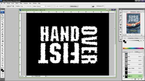
Project Assignment 2 Details
1 outline
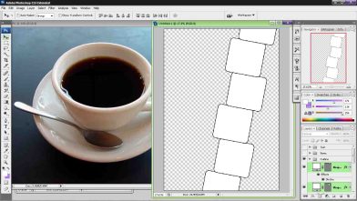
I first draw the outline fo the boxes that arrange vertically. They are to be replaced by pictures that take in the exact shape of the boxes. Thus the outline can be highlighted by ctrl+click layers
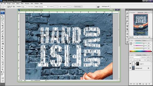
2 Pictures Color
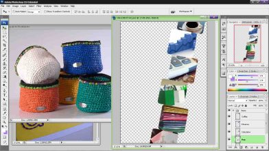
I want to show each boxes has it’s own color, so i changed calculator to yellow, the coffee tea as orange, and more green to the pens. I did this by opening a layer and draw a color with different layer mode: color and overlay.
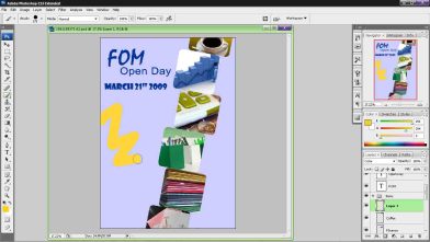
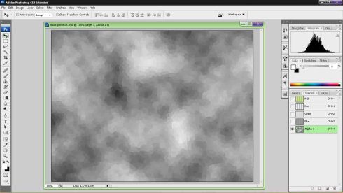
3 Background Text
This is to create a sight where there’s text floating behind the paper. The text are reference to the majors offered in FOM. The text are adjusted with Box blur + transparency

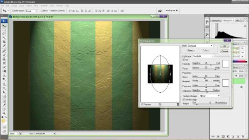
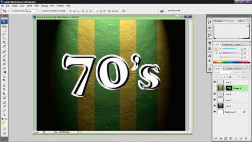
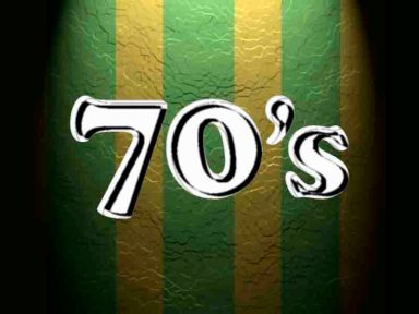
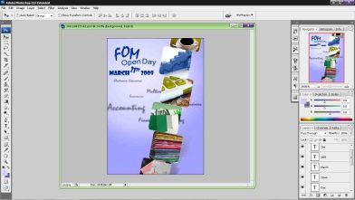
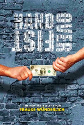
4 Shadow
This is a very first experience. I don’t wish to make a shadow that outline the edge, but somehow drop on the background as if the tower of picture is placed on the floor. Firstly, I need to combine the outline of boxes and merged them into one. With one layer, I can adjust their shape by transform; making them look more into the shape of shadows. Then, I applied gradient to have darker color on the lower part, lighter dark on the upper part.
Until now, the shadow will look completely solid. I adjust the tranparency of the gradient. Another move is to use eraser tool to erase it; many of which are the edge of the shadow. I;d continuing use eraser tool until it looks like shadow and finished.
5 Text
FOM Open Day March 21st 2009. That’s it, I chose the font style and size. Another thing is to rotate them by transform.
6 Additional Stuff
I need to include a MMU logo. This is simple, the original has a white background. The only wat to remove them is to use magic wand tools. Remove them and the color not of white will remained.
The picture seems to be complete, but there’s a large area that seems empty at the bottom of the paper. SO I add a msc logo there. Same process, magic wand tool will be used to remove any white areas.
I kinda wanted to have the logo shown on the open space, while the text can be partially shown. Thus, I create two of them and erase the text one one, and logo on another layer. I apply gaussian blur to remove some sharpness and make it blurring. Then, their transparency has to be adjusted to blend with the background.
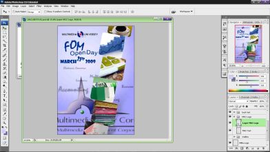
7 Final Adjustment
I wanted to change the edge of the boxes of pictures. This can be done by combining all of them to be come one, then highlighted the layer edge by ctrl click. Then, go to marquee tool and change refine edge…
This option can adjust how much will be selected around the edge, the objective here is to highlight a small prtion of it so I can erase some of the edge using eraser tool. After refine edge, select inverse to highted the outer layer and use eraser tool to erase just the unwanted area. The non-highlighted area will not be erased.

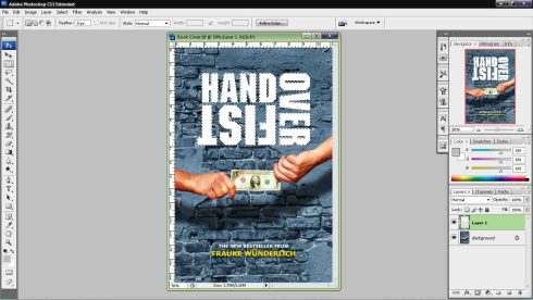
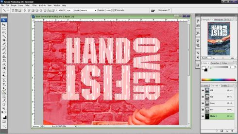
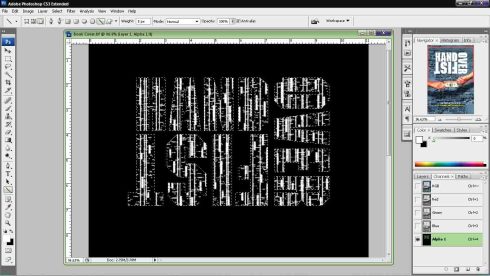
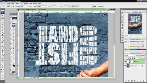
Tutorial 05
The tutorial here is to teach how we could create something from scratch, and that something can be added with some effect.
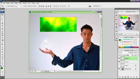
First we are to make a brush preset. We draw it using lasso tool, use gaussian blur to soften the area, and brush the edge with dark color.

Once I set the preset I was able to draaw many of them using the brush tools. This I am to draw tons of them to create the flaming effect on his hand. The color white is used. Later the box that appeared below are resulted from the filter of cloud using two different color. Use Color level to adjust the color of he box, because the box is meant to filling that into the flame.
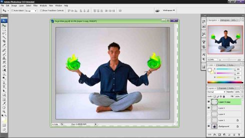
As you can see, the flame has the color, and the distortion was caused by liquify filtering. In Liquify, there’s lot of option you can play with. Thus I create something like of japanese anime design of ghostly fire.
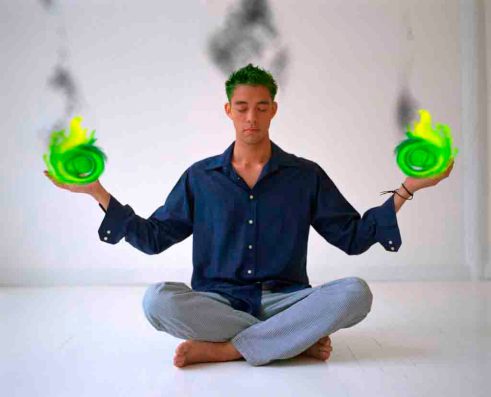
Next is the black smoke. I realize that now i know how to create cloud out of the same technique used to create the color of the flame. You can adjust the appearance of the colouring in the color level. The original color is white and black, but the color level has made it look as if there’s only black color floating on the air. Amazing.
A2 Project Charter
Project Charter Assignment 2
Assignment 2 Title: FOM Open Day at March 21st 2009
Project Start Date: 8 December 2008
Project Finish Date: 23 December 2008.
Project Manager: Erwin Goh Chau Boon (1061108373)
HP: 0146558970
Email: cole_triquetra@hotmail.com
Project Objective:
The objective is to create a digital image as a wallpaper .The theme would be MMU FOM Open Day dated March 21st, 2009 .
Approach:
The main theme is stationary; a tribute to show FOM working equipment in a professional level. The background color is blue signifying blue collar; while the other objects should stand out as colorful as possible.
Tools that involved will be eraser tool, rectangular tool, text tool, marquee tool and possible additional tools. The effects used will be blending option, filtering, and significant adjustment that is taught in the tutorial video.
Firstly, there are so many references that could be collected on the net. The main objects are stationary, while include one of the buildings from the MMU campus.
The collection will be imported to Adobe Photoshop for rearrangement and adjustment; especially in concerned of colors.
Then, texts play a role to tell information regarding the announcement it wish to make.
Reference:

http://www.flickr.com/photos/kasaa/2502365617/
http://www.flickr.com/photos/kasaa/2720618062/


Roles and Responsibilities:
Submission is 2nd Jan 2009 by 12 p.m.
The creation log will be recorded in the blog as detailed as possible.
Consultancy is recommended to be revised by tutor.
Tutorial 4
The goal of this tutorial is to bring this picture into something off an liquid or icy effect.

The first tweak is a combination of effects in the blending option.
Gradient Overlay – apply gradient color
Inner Shadow, Drop Shadow, Outer Glow – draw outline around the edge
Bevel and Emboss – make the text look likes floating
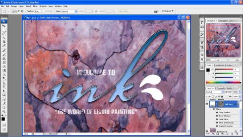
Next is to apply the same thing to the two droplets. However, the tutorial thought about the usage of layer style. Thus, you can save your layer style and access them later.
The bigger step is here, the upper droplets has to be change to somewhat liquid by blending the background to it. This can be achieved by a complicated step that involved channel layer, and apply the texture at bevel and emboss>texture.
Here, the tutorial taught us how we can draw the layer style to other places. This can be done by making a new layer with a new solid object, apply the layer style. As the whole solid object is icy surface, we need to reverse it so we can draw out the layer. Much like the process in tutorial two. Thus, we use layer mask, ctrl+d to revert, then draw to reveal it.
Finally, in the blending option, decrease the opacity of the entire effect will somehow remove the some of the color that make it looks like a cover of ice.
Tutorial 03
Tutorial 3 worked on the usage of channel and path layer.
The objective is to create patch of paper on the wall which looks natural; thus the idea is to create something that has been patch for a long time, thus, you can see torn parts of the paper.
First, we use line tool to draw several line representing the torn part. This is done in channel layer. After drawing the line, I run a filter to pixelate the words for realistic effect of the paper being torned. Then, blurred the images to remove sharp lines.
This is then paste to the normal layer.
Next, we need to remove part of outer part of the paper to make it look realistic. Following the same process, we use edit/stroke to remove a part of the outer layer. Then, applied a filter to spatter some of the paper. The effect make it’s look as the paper torned from the outside first.
Therefore, these two effect was then combine all together by pasting this on top of the normal layer.
As final adjustment, the blending option, underlying layer to create more torned effect.
Tutorial 02
Here I choose this picture as my choice for this tutorial.
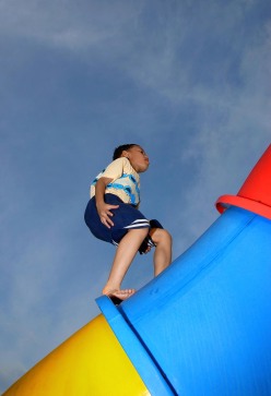
First thing off, the video told us that we better make a new layer and change it’s mode to color. It’s better not to waste the original. Thus I open three layer adjusting the color of the… tube the kid is walking on.

The next thing, I hope to make the sky look a bit rainy. Thus, I use marquee to select the sky and change a bit of the color in hue/saturation.

Ah, I add a bit stripes at the… tube ne… Now this seems a bit nostalgia isn’t. What if I change the boy to gray scale.
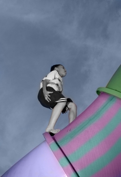
Ahaha… looks strange now.
Assignment 1
Assignment 1 : Post Card Malaysia Truly Asia
Project Due Date: 28 Nov 2008
1061108373 Erwin Goh Chau Boon
Project Objectives:
Students are to create a multi-cultural event for a post card. The theme would be “Malaysia, Truly Asia” which is the official slogan for Malaysia Tourism. Students are to show the multi-cultural aspects of Malaysia culture or life as a positive feature to attract tourist into this country.
Approach
The main subject is the people of Malaysia in which they are divided into many culture and races. The color will stay in the line of contrasting two main colors: black and red. The detailed process will be available in the blog.
Role and Responsibilities
My job is to finish the post card. The file is build of 8 x 6 inches with 300 resolutions under CMYK.
The submission should be in the form of hardcopy where I had to make a printing; and soft copy of which I need to upload them into MMLS. The softcopy is a zip file composes of “1061108373_Assignment1.psd”; and a folder “assignment1_ref” where the footages are stored.
Additionally, this project charter is to be submitted to MMLS and post in the blog.
Comment
The whole process of making is simply using what I know to manipulate different pictures into one. I have learned that I should calibrate my screen color setting before working on photoshop. This mistake is obviously reflected on the printing which it has appeared darker.
Process LOG
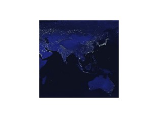
Earth Night.jpg
The goal is to make a portion of the map look a bit curve. I selected a portion of Earth Night.jpg which is a picture of earth map during night.
- Elliptical Marquee Tool: grab a round shape of the map and cut
- Transform: warp the picture to something like a curve
- Adjustment: blur more, inner shadow
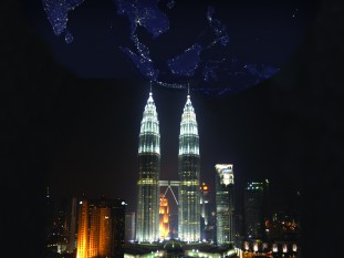
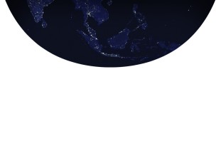 Petronas.jpg
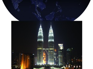
The tower is to stand in the middle of the picture with the night sky showing stars assembled into the map of Southeast Asia.
- Clone Stamp Tools: cover all white area to black
- Magic Wand Tool: Highlight the area of Earth Night.jpg, then switch to…
- Eraser Tool: remove all the area blocking the earth night.jpg following the selected area.

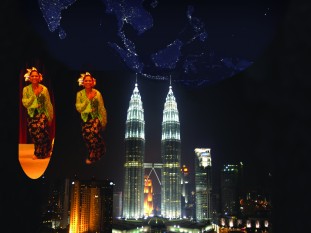
Dancer.jpg
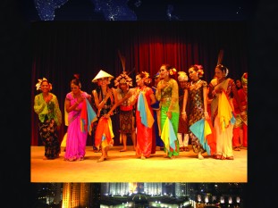
The next thing to do is to put as many people as I can to filled up the empty spaces. It was Originally to put several faces of different races. However, the dancer.jpg is the only source I have that I thought is reliable.
- Marquee Tools: cut out 3 or individual dancers
- Eraser Tool: remove unwanted area, repeat this process on other dancers
- Arrangement: arrange the dancer in a desired fashion
- Marquee Tools: select dancers and invert selection and…
- Adjustment: applied radial blur just to the edge of these dancers
Text Malaysia Truly Asia
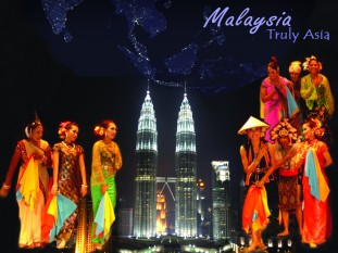
Hibiscus.jpg
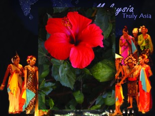
Eraser Tool: removed unnecessary area and maintain only the flower
Finishing Move
To match the bright output of the dancers, the petronas need a little bit color adjustment.
- Blending option: Satin to provide Petronas.jpg with more color(orange) by opacity 10%
- Adjustment: notice unsatisfied area and re-arranged to perfection
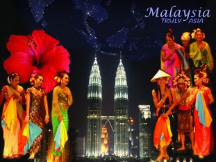
Finished.
Tutorial 01
Below is several screenshot of progresses I made during this tutorial. The footage are a background of skyscraper, starfish, and a plasma TV.
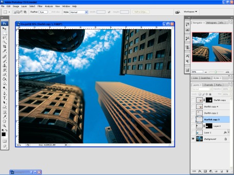
This is the original images which has given a perspective it self. The picture was taken from bottom to the top. Thus, the focus point are somewhere in the middle of the sky. By following the tutorial, the several radius from the middle has been blurred.
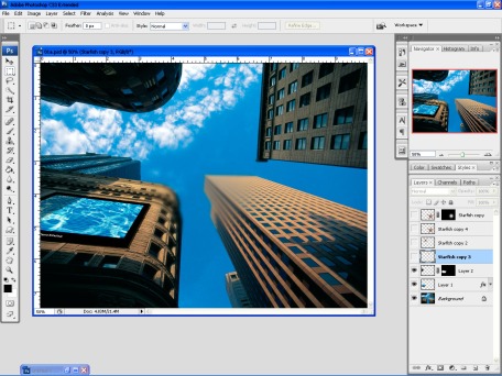
Now, I had add a plasma TV. That TV was originally plain, you know. I did a little tweak learned from the tutorial video and there u go a plasma TV with the shadow on its face.
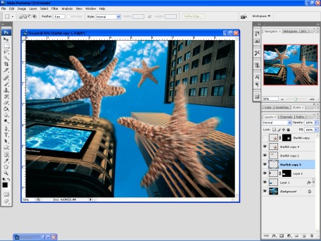
The next thing is the starfish. The significant of this part is to show the near and far; sort of the “depth of field”. The nearest has been adjusted with radial blur.
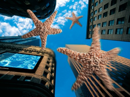
This is the final product. There’s still a little bit weird though, but the nearest starfish looks fine.
Lesson learned: Gaussian Blur for vision depth; Radial Blur for motion; Pattern for the plasma TV; layer mask for shadows applied to the surface of the plasma TV.
Origin
This blog is created as requested by MCG1024 Computer Graphic 2. It’s a blog that would record “THE MAKING” of various assignment which would be submitted through the entire semester.
